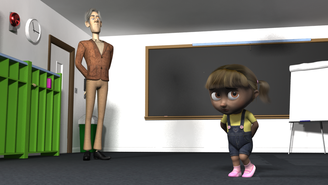
Here's my animatic with some more animated previews in, with a few unecessary shots cut out.
Monday, 16 May 2011
Render setup details
Some quick details of my render setup while i'm rendering a scene out.
Once i had lit my environment to my satisfaction, of which the render times were running about 6 mintues a frame, i decided to do some tests with the characters in there. Adding the characters caused the per-frame render time to shoot up to about 11 minutes. This was unacceptable, so i decided to render the characters and environments separately. Since my camera didn't move in very many shots, this meant that i saved a lot of render time, as the characters only took roughly 2-3 minutes a frame.
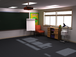
There were two main challenges in doing this - light matching and shadows. I'll briefly cover the differences between my two lighting systems, to explain why i would need to light match. The environment lighting had 3 main types of light. Firstly, there were a number of photometric area lights used as the strip lights for the ceiling. These would provide a lot of fill light for the scene, and i also set them so that any camera that looked at the ceiling would see their area as white rectangles, like a real ceiling light. Using photometric lights instead of normal mental ray ones enabled me to use photometric light distribution lattices, which emulate the way lights shine out of their housing (in this case through a piece of textured plastic).
Next i had a setup of a skylight and some MR Sky Portals. I set up the skylight to have a gradient running from a light violet to a pastel orange. These lights give some vibrancy and colour to the area around the window, and make some contrast with the darker corners of the room. Thirdly, i made a MR Area Spot light, and put it very, very far away from the scene. This would simulate the direct sunlight shining into the classroom. I used an mr area spot instead of a basic direct light because i wanted to use Ray Traced Shadows, because of the softer edge it could give to the shadows. In the screenshot below you can see the lighting setup.
This lighting solution was great for my environment, but lots of photometric area lights combined with all of my characters' high resolution textures and hair was producing too long render times. Instead, i started with a basic 3 point lighting system, and then added a number of extra fill lights, to simulate the ceiling lighting, light spilling in from the windows and the global illumination used in the environment render.
Matching the light between the environment and characters was simply a case of fiddling with the light settings until i had one i was happy with, making sure the main light came from the same direction as in the scene, but also making sure i had nice detail on my characters. I could then comp this together in after effects. Below is an example of a shot i comped together.
A further problem i had with this compositing approach was their hair, especially the little girl. When Max renders out the objects in the scene that are translucent it assigns the colour of the background to any pixels that are not completely transparent. I had initially set this up as a blue colour, to simulate the sky on any shots that had any sky visible. You can see the problem in the shot below:
 |
| A completed render of a frame from my animation. |
Thursday, 12 May 2011
some more shots animated
I have now animated a few more shots. Again, there is still a little tweaking to be done for each. I also tested rendering one of the sequences, and that blasted skin artifact problem has resurfaced, only it moves between frames, making this horrible skin flicker! Nightmare...
Saturday, 7 May 2011
Preview Shot
Was having some render problems with the skin on my characters when i was using my desired lighting setup. Here's a picture to illustrate the problem:
Spent the best part of a day trying to solve the problem, and then looking into alternatives, only to discover that i HAD to use the specific lighting setup i wanted to get nice looking results. In the end i fixed it by tweaking random settings in the material, and then putting them back to what they were, leading me to believe it was just a bug or glitch in the material, and by fiddling i managed to reset the problem.
Wednesday, 4 May 2011
Hands reference footage
This is reference footage for the hands of god for the chalk board sequence in my animation:
NEw animatic edit
Following on from a previous session i had with a tutor, i decided to implement a few changes top my animatic, specifically to add some 2D animated sections on the chalkboard to engage the watcher in what they draw, and some other changes to make the story read a bit clearer. Here it is
Tuesday, 3 May 2011
Environment Lighting
These past few weeks i have been finishing texturing my environment, adding some detail to the parts of it that are visible, and adding some character with some wall displays. On top of that, i have been lighting my textured environment, and have reached a render that looks quite nice:
This is using a bunch of different lightings and some global illumination and final gather settings. The drawers on the right are not really seen in many of the shots, so their texturing is very basic.
I have also rigged all of my characters to an acceptable standard, and they are now ready to animate! Unfortunately, some problems have arised with the lighting that i'm using causing unacceptable artifacts on the skin shader of my characters, as seen below:
I'm currently seeking advice from the internet, and may ask some tutors at some point, although none of them work in my program, so are unlikely to be able to solve this specific issue.
I'm also taking stock today, taking the amount of time i have remaining into account and editing my animatic. I'm going to refine and finalise all my camera shots, maybe take a few out if i can. At present, i am confident i can finish in time, with my biggest worry being the rendering. If nothing else goes wrong with the renderer this shouldn't be too much of an issue, but i have just upgraded my PC to be sure, and now have access to two high powered rigs to run off my renders.
Friday, 22 April 2011
Work on priest textures
Been hard at work on my priest's textures. His body took me ages, but since i documented my process for my professor and this was much the same, i'll skip straight to the results.
Thursday, 7 April 2011
Aspect ratio tests
I did a quick test to try to decide which aspect ratio and resolution i should use for my animation. They are as follows:
Standard Definition 4:3 - Render 5 minutes 14 seconds

Full HD 16:9 1080p (vertical) - Render Time 13m 41s
As you can see the full HD one looks really nice, but it puts the render times outside of my target of roughly 5 minutes.
Standard Definition 4:3 - Render 5 minutes 14 seconds
16:9 Widescreen 1080 width - Render Time 5m 16s

Full HD 16:9 1080p (vertical) - Render Time 13m 41s
As you can see the full HD one looks really nice, but it puts the render times outside of my target of roughly 5 minutes.
Monday, 4 April 2011
Girl hair test
Decided to keep going with the hair tool. Here's some shots of how the hair is coming along for my girl character.
I'm quite pleased, although i think the fringe needs more mass to it,right now it seems very flat
Saturday, 2 April 2011
Little Girl Textures
Been working on my little girl's textures, focusing on her clothes to begin with. Here's how it's looking so far:
Monday, 28 March 2011
Prof Face Texture adjustments
Once i had the basic texture right, i decided to collapse the symmetry so i could make the textures unique on each side of the face. You can see in the image below how his forehead wrinkles are mirrored, and it doesn't look great.
Upon doing this, i decided to redo all of the textures to make them more subtle and fix any problems i saw. Once i had done this, i went through a bunch of settings in the renderer to try and fix them. Here are a few renders of the stages i went through whilst fine tuning:
And here is the stage i am now happy with.
Prof Face Texture
I have now done more texturing work on my professor, unwrapping and texturing his head.
I've used a SubSurface Scatter Skin material, and have painted and plugged some mats into several diffuse channels, a bump and a specular channel.
Although i'm not completely finished, i'm quite pleased with the results so far:
I've used a SubSurface Scatter Skin material, and have painted and plugged some mats into several diffuse channels, a bump and a specular channel.
Although i'm not completely finished, i'm quite pleased with the results so far:
Friday, 25 March 2011
Eyebrow and ear tufts
Following on from my previous hair experiments today i tackled the prof's eyebrows and his side burns. Because these need to come out of an area of his skin i made this hair by using a modifier on his head model itself.
I was a little worried about how this would work in relation to his morph targets for facial expressions, but a little experimentation showed that it would be no problem (although the featured expressions are by no means final)
Thursday, 24 March 2011
Hair experimentation
I've been experimenting with several different methods of hair for my characters. Ideally, i would like to use an actual hair tool for their hair, as this would yield the best results. It also has a massive impact on my render times, which had put me off using it.
Initially i tried making the hair out of a poly, and was going to paint on the hair, which gave a sort of cartoony stylised look. I only painted the two side bits before i decided that i didn't really like the result.
Instead, i have gone back to the hair tool, beginning with my professor, as his hair is the most complex. I drew splines along the surface of the hair mesh, then used this cage to create the hair on, giving me a lot of control over the hair's pathing. You can see the process in the image below:
Using this tool adds a minute or two to my render time, but i think the results are well worth it.
Unfortunately, this only gives a sort of shell of hair - the hair originates at the start of the splines, and gives the illusion of a head of hair, it does not come out of his whole head. This means that in some places you can see his scalp through his hair, and is not great for his sideburns or eyebrows. As such, i am planning on using a different hair creation method to cover these gaps, so come back soon!
Monday, 21 March 2011
Texturing Process Breakdown
I've made some more progress on my texturing of my professor, so i thought i'd do a little breakdown of my process here.
First i start by unwrapping the model, by selecting a set of faces, and applying a basic unwrap mode to it (e.g. planar or cylindrical), or by using my QucikUnwrap script to get a basic unwrap. I then finesse the shape in the editor, using a checker texture as an aid. The unwrapped UVs are laid out to fit on the sheet.
A texture is sourced, from my own clothes if possible. Using a photoshop filter and clone stamp the texture is made to tile. It is then duplicated to fill the chosen area of the sheet.
At this point I apply the texture to the model, and look for any problem areas. In the case below the texture was warped where some UVs were not welded together properly, and was easily fixed.
Once the texture looks roughly right on the model, I "paint" some seams on, by using the dodge and burn tools to give the impression of a edge.
Then, by editing our brush settings, I create a brush that paints on some stitches, to give some detail to the seams. You can see the brush settings below:
This process is replicated over all the other relevent areas of the model.
Finally, once i'm satisfied with the texture, i flatten it, and desaturate it to turn it into a bump map. On review, i normally edit the levels, and paint some more contrast onto areas, such as the pocket below.
And there is one textured model. At present i am working on half of a model that i have applied symmetry to. Once i am ready to collapse the stack, i will do so, and fix any parts that need to be non-symmetrical, such as the flies on these trousers.
Subscribe to:
Comments (Atom)


